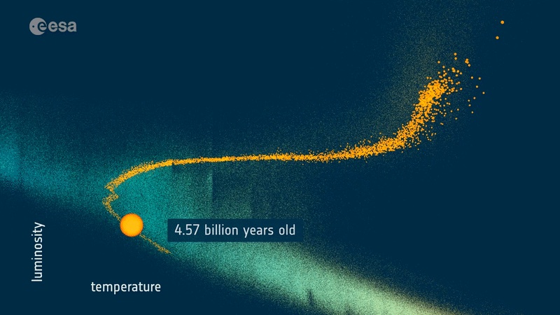
Our Sun is doomed. Billions of years from now, the Sun will deplete its hydrogen fuel and swell to a red giant before becoming a white dwarf. It’s a well-known story, and one astronomers have understood for decades. Now, thanks to the latest data from Gaia, we know the Sun’s future in much greater detail.
The timeline of human civilization is a mere blip in the lifetime of a star. We haven’t been around long enough to watch a star’s birth, life, and death. But we can understand stellar evolution by observing other stars that may be older or younger than the Sun. It’s similar to the way you might understand how humans live and die by looking at a collection of photographs all taken at the same time on a single day. One of the first snapshots of stellar evolution was done in the early 1900s. First as a data table by Ejnar Hertzsprung in 1905, but more famously done as a diagram by Henry Norris Russell in 1914. Now known as Hertzsprung-Russell diagrams, or HR diagrams, they plot the color or spectral class of a star versus its absolute magnitude. Color is a measure of a star’s temperature, and absolute magnitude is a gauge of its size.
 The first HR diagram vs Gaia’s modern diagram. Credit: Left, Russell. Right, ESA/Gaia
The early HR diagrams only had data for about 300 stars, but even then it was clear most stars lay along a linear path known as the main sequence. Since most stars are within the main sequence, it stands to reason that stars spend most of their lives as main sequence stars. Small stars shine at cool temperatures, while larger more massive stars burn hotter. The HR diagrams showed that some stars such as red giants were large but cool, and others known as white dwarfs were small and hot, but those were the exceptions. As astronomers gathered more data, they could see how larger main sequence stars entered a giant stage before becoming white dwarfs or neutron stars. By and large, the mass of a star determines its lifetime and fate.
We now know that while the mass of a star is an important aspect of stellar evolution, its chemical composition also plays an important role. Two stars similar in mass but different in composition can have very different lifetimes. This is where the Gaia survey comes in. Whereas early stellar surveys had hundreds or thousands of stars, Gaia has more than a billion. In the latest data release, the Gaia team created an HR diagram of more than 4 million stars within 5,000 light-years of Earth. For these stars, we know not only their size and spectral temperature but also know their chemical composition. This means the Gaia team could create an HR diagram of stars with a similar mass and composition to the Sun. The result traces the evolutionary path of Sun-like stars from the main sequence to the red giants. Based on the data, the Sun will reach its maximum temperature at an age of 8 billion years, then shift toward the red giant phase before finally dying at around 11 billion years old.
 The path of similar stars shows the Sun’s fate. Credit: ESA/Gaia/DPAC, CC BY-SA 3.0 IGO
The Gaia team also found nearly 6,000 stars that are near twins of the Sun, having similar mass, temperature, composition, and age. By observing these stars, astronomers will get a better understanding of whether our Sun is typical. For example, do these other stars have solar cycles similar to the Sun? Do some have periods of intense solar flares or are they fairly stable like the Sun?
With so much gathered data, Gaia is revealing new details about our own star, how it may behave in the near future, and how it will die in the far future. We’ve long known the end is nigh for the Sun, but we’re beginning to learn just how and when the end will come.
Reference: Creevey, O. L., et al. “Gaia Data Release 3: Astrophysical parameters inference system (Apsis) I–methods and content overview.” arXiv preprint arXiv:2206.05864 (2022).

